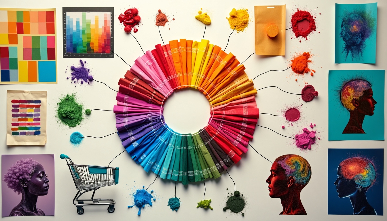
Color psychology harnesses the power of visual cues to influence customer behavior and purchasing decisions. By understanding how different hues affect emotions and perceptions, you can strategically use colors in branding, packaging, and marketing to evoke specific reactions. Red creates urgency, blue instills trust, and yellow sparks optimism. However, cultural variations in color meanings must be considered for global markets. Effective use of color schemes in logos, websites, and store designs can enhance brand identity and customer experience. From product packaging to digital marketing, color choices play an essential role in shaping consumer attitudes. Dive deeper to access the full potential of color psychology in your marketing strategy.
Key Takeaways
- Colors evoke specific emotions and physiological responses, influencing consumer behavior and decision-making.
- Red stimulates excitement and urgency, blue promotes trust, and yellow signifies optimism in marketing contexts.
- Cultural variations in color perception necessitate thorough market research for effective global branding strategies.
- Effective website color schemes use 3-4 colors, ensuring contrast for accessibility and reflecting brand identity.
- Product packaging colors significantly impact consumer perception, with each hue conveying distinct messages and emotions.
The Science Behind Color Psychology
Nearly every aspect of our lives is influenced by color, from the clothes we wear to the products we buy. Color psychology examines how different hues affect human behavior, emotions, and decision-making processes. This science is rooted in both physiological and psychological responses to color stimuli.
Your brain processes color information through specialized cells in your retina called cones. These cones send signals to the visual cortex, which interprets the colors you see. Simultaneously, this visual input triggers responses in other brain regions, including those responsible for emotions and memory.
Research has shown that certain colors can evoke specific physiological reactions. For instance, red can increase your heart rate and blood pressure, while blue may have a calming effect. These responses are often subconscious and can considerably impact your mood and behavior.
Cultural and personal experiences also play an important role in color perception. While some color associations are universal, others vary across cultures. For example, white symbolizes purity in Western cultures but represents mourning in some Eastern societies.
Marketers and designers leverage this knowledge to create products and environments that elicit desired responses from consumers. By understanding color psychology, you can make more informed decisions about the products you purchase and the environments you frequent.
To protect yourself from manipulative color tactics, it's vital to be aware of how colors might influence your choices. By recognizing these subtle cues, you can make more rational decisions based on your true needs and preferences, rather than unconscious emotional responses to color stimuli.
Primary Colors and Consumer Emotions
Primary colors—red, blue, and yellow—play an essential role in shaping consumer emotions and behaviors. These fundamental hues serve as the building blocks for countless color combinations and can greatly influence how customers perceive and interact with products, brands, and marketing materials.
Red, the most intense primary color, evokes strong emotions and can increase heart rate and blood pressure. It's often associated with excitement, passion, and urgency. You'll find red used in clearance sales, fast-food restaurants, and emergency services. However, be cautious when using red, as it can also signify danger or aggression.
Blue, in contrast, has a calming effect on consumers. It's linked to trust, stability, and professionalism. You'll see blue prominently featured in banking, healthcare, and technology sectors. Blue can help create a sense of security and reliability for your brand, making customers feel safe and confident in their choices.
Yellow, the brightest primary color, is associated with optimism, cheerfulness, and energy. It can grab attention quickly and stimulate mental activity. You'll often encounter yellow in children's products, fast-food chains, and warning signs. However, use yellow sparingly, as too much can cause visual fatigue and anxiety.
When incorporating primary colors into your marketing strategy, consider their psychological impact on your target audience. Thoughtful use of these colors can help you create a safer, more trustworthy brand image.
Remember to balance primary colors with neutrals or complementary hues to avoid overwhelming your customers and maintain a harmonious visual presentation.
Cultural Variations in Color Perception
While primary colors evoke universal responses, it's important to recognize that color perception can vary markedly across cultures.
What might be a positive, safe choice in one country could be off-putting or even offensive in another. Understanding these cultural nuances is essential for businesses operating in global markets.
In Western cultures, white often symbolizes purity and cleanliness, making it a safe choice for healthcare products.
However, in many Asian countries, white is associated with mourning and death. You'll want to be cautious when using white prominently in these markets.
Red is another color with diverse cultural interpretations. In China, it's considered lucky and used in celebrations, while in South Africa, it's associated with mourning.
You should research your target market thoroughly before incorporating red into your branding or packaging.
Blue is generally seen as a safe, trustworthy color in many Western countries, often used by financial institutions.
However, in Middle Eastern cultures, blue can be associated with protection against the evil eye, giving it a different connotation.
Green is widely perceived as natural and safe in many cultures, but in countries with dense jungles, it might evoke feelings of danger.
In Islamic cultures, green holds special religious significance.
To guarantee your color choices resonate positively with your audience, you should:
- Conduct thorough market research on local color associations
- Test your color schemes with focus groups from the target culture
- Consider using culturally neutral colors when in doubt
- Adapt your color palette for different regions if necessary
Color in Branding and Logos
When it comes to branding and logos, color choices can make or break a company's visual identity.
You'll find that successful brands carefully select their colors to evoke specific emotions and associations in their target audience. These color choices aren't arbitrary; they're based on psychological principles and cultural norms.
You'll notice that many financial institutions and insurance companies opt for blue in their logos. This isn't a coincidence. Blue represents trust, stability, and professionalism – qualities these companies want to project to their customers who seek financial security.
On the other hand, fast-food chains often use red and yellow. Red stimulates appetite and creates a sense of urgency, while yellow is associated with happiness and optimism.
Green is frequently used by eco-friendly and health-focused brands. It symbolizes nature, growth, and well-being, making customers feel safe about their choices.
Tech companies often lean towards sleek grays or silvers, conveying innovation and reliability.
When designing your brand's visual identity, consider the psychological impact of your color choices. You'll want to guarantee they align with your company's values and resonate with your target audience.
Remember that color combinations can also affect perception. Too many bright colors might appear chaotic and unprofessional, while a monochromatic scheme could seem boring or uninspired.
It's vital to test your color choices with your target audience before finalizing your branding. You'll want to confirm that your chosen colors effectively communicate your brand's message and create a sense of trust and safety for your customers.
Effective Color Schemes for Websites
How do you create a visually appealing and user-friendly website? The answer lies in choosing an effective color scheme that aligns with your brand and resonates with your target audience. When selecting colors for your website, it's essential to prioritize safety and trust.
Start with a neutral base color, such as white or light gray, to create a clean and professional look. This approach guarantees your content remains readable and reduces eye strain for visitors.
Next, choose one or two primary colors that reflect your brand identity and evoke the desired emotional response from your audience. For instance, blue conveys trustworthiness and stability, while green suggests growth and harmony.
Use accent colors sparingly to highlight important elements like call-to-action buttons or key information. Avoid using more than three to four colors in your overall scheme to maintain a cohesive and balanced design.
It's also vital to take into account color contrast for improved accessibility and readability, especially for users with visual impairments.
Remember to test your color scheme across different devices and browsers to confirm consistency. You'll want to make sure your chosen colors display correctly and maintain their intended impact regardless of the user's screen.
When in doubt, stick to tried-and-true color combinations like monochromatic, complementary, or analogous schemes. These classic approaches can help you create a harmonious and visually pleasing website that instills confidence in your visitors.
Product Packaging and Color Choices
Color psychology isn't limited to digital spaces; it plays a major role in product packaging too. When you're designing packaging for your products, the colors you choose can markedly impact consumer perception and purchasing decisions.
Understanding how different colors affect buyers can help you create packaging that resonates with your target audience and promotes a sense of safety and trust.
Red packaging can create a sense of urgency and excitement, which may be effective for impulse purchases. However, it mightn't be the best choice if you're trying to convey a message of safety or reliability.
Instead, consider using blue, which is often associated with trust, dependability, and calmness. Blue packaging can reassure customers about the quality and safety of your product.
Green is another color that can evoke feelings of safety, particularly for natural or eco-friendly products. It's associated with health, freshness, and environmental consciousness.
If your product aligns with these values, green packaging could be an excellent choice to appeal to safety-conscious consumers.
White packaging can convey cleanliness, purity, and simplicity. It's often used for medical or health-related products to reinforce a sense of sterility and safety.
Combining white with other colors can create a balanced, trustworthy appearance.
When selecting colors for your product packaging, consider your target audience's preferences and cultural associations.
Test different color combinations to see which ones resonate best with your customers.
Remember that consistency across your brand's color palette can help build recognition and trust over time, reinforcing the safety and reliability of your products.
In-Store Color Strategies
Numerous retail establishments leverage color psychology to influence customer behavior and create a specific atmosphere within their stores. You'll notice that many stores carefully select their color schemes to evoke specific emotions and guide your shopping experience.
When you enter a store with a mainly blue color scheme, you're likely to feel calm and trustworthy. This is why many banks and financial institutions use blue in their interiors. It's designed to make you feel secure about your financial transactions.
Red is often used in clearance sections or for sale items. When you see red, it creates a sense of urgency and excitement, potentially encouraging you to make quick purchasing decisions. However, it's used sparingly to avoid overwhelming you.
Green is commonly found in health food stores or organic sections. It's associated with nature and health, making you feel more confident about your wellness-related purchases.
Yellow and orange are energetic colors that can stimulate your appetite. That's why you'll often see these colors in fast-food restaurants or food courts.
Neutral colors like beige, gray, and white are used to create a sense of spaciousness and cleanliness. High-end stores often use these colors to convey a sophisticated atmosphere and make their products stand out.
Lighting also plays an essential role in in-store color strategies. Warm lighting can make a space feel cozy and inviting, while cool lighting can create a more clinical, professional atmosphere.
Color Psychology in Digital Marketing
Just as brick-and-mortar stores use color psychology to influence customer behavior, digital marketers employ similar strategies in the online domain.
When you're browsing websites or scrolling through social media, you're constantly exposed to carefully chosen color schemes designed to evoke specific emotions and actions.
In digital marketing, color plays an essential role in brand recognition and user experience. You'll often see blue used by financial institutions and tech companies to convey trust and reliability.
Social media platforms like Facebook and Twitter also use blue to create a sense of security and openness.
Red is commonly used for call-to-action buttons or sale banners, as it creates a sense of urgency and excitement.
You'll notice this color on “Buy Now” or “Limited Time Offer” buttons, encouraging you to make quick decisions.
Green is associated with growth, health, and environmental concerns. You'll find it used by eco-friendly brands, health food companies, and financial services to symbolize positive change and stability.
Yellow and orange are attention-grabbing colors that can create a sense of optimism and affordability.
You'll often see these hues used by budget-friendly brands or to highlight special promotions.
When designing websites or digital ads, marketers consider color contrast to guarantee readability and accessibility.
They'll use complementary colors to make important information stand out, guiding your eye to key messages or actions.
Understanding color psychology in digital marketing helps you become a more informed consumer.
Conclusion
You've now revealed the rainbow of consumer psychology. Like a master painter, you can wield colors to evoke emotions, build trust, and guide purchasing decisions. Remember, there's no one-size-fits-all palette; cultural nuances and individual preferences add layers of complexity. As you apply these insights to your branding, packaging, and marketing efforts, you'll create a vibrant fabric that resonates with your target audience and sets your business apart from the competition.